You’ve prepared a stellar, comprehensive brief for your package design firm, waited anxiously for the presentation of their first creative work, and are just about to choose the design that will help to make or break your brand. No pressure!
Here are few thoughts that could help you make the right choice among the array of design work presented.
1. Plan your package design for growth.
Think about building a package architecture flexible enough to adjust for successful expansion beyond your initial product concept.
What happens to the design when you add other flavors, other functions, or expand your brand into other product categories?
Flexibility and being willing to take informed risks are qualities praised in business books, and rare in business practice. It’s easier for smaller companies and new brands to take the risk of being flexible and innovative. It’s what consumers look for from them, the way they get noticed, accepted and preferred.
One of our recent smaller projects at CMA began as a product intended for distribution in DIY big box and hardware stores. Our client’s product development team extended the brand to products more suited to Health and Beauty channels. Suddenly the yellow and black retro label looked too harsh and masculine for that environment. We went back to work on the design, combining elements of the original with softened colors, and incorporating a flexible system of differentiation for a variety of product areas. Since our relatively small client did not have a huge printing, advertising, and sales investment in the initial design, it was simple for them to adjust the look of the package to better suit the new expanded target of the brand.
Major branded package design studies establish a set of brand assets: colors, typography, a photo or illustration style which remains consistent. Careful adherence to a consistent set of visual elements help support consumer understanding that the brand is a sign of steady and reliable quality. This consistency in branding becomes a valuable business property, and as a result a greater risk for these large companies to change too much of their package in a redesign.
The challenge for marketers with an established design is to remain flexible enough so that risk aversion doesn’t hinder necessary improvements.
CMA has worked with the Simply juice brand since 2001 as it grew from a single orange juice into a billion dollar brand with multiple juice varieties.
Simply entered the market with a unique structural design, an elegant clear plastic carafe with a large green cap. This carafe structure was a first in the category, a shelf standout that embodied the brand promise of a better juice. The carafe has contributed significantly to the brand’s success, and has since been copied by competitors. (More on this in a few weeks!)
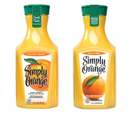
The first Simply label is a good example of a design which worked well for the initial offering, but could have been improved if the designers could have foreseen some of the issues that arose as the line was extended. The Simply Orange logo was hand lettered in black, surprinted on a bright, illustrated orange. To make the most of a narrow label area, the Simply Orange lettering and the fruit illustration occupied the same space. If the first design of Simply Orange had been planned for broad future juice line extensions, the problem of the black lettering surprinted over dark fruits like limes or cranberries would have surfaced early.

Because of the perceived risk of changing the design of a successful, growing brand, over the years the Simply juices line accumulated a set of design elements that were not working as cleanly as they could have. New flavors and benefits added more color and complexity to the hand lettered typography. This began to interfere with the desired simplicity of the brand character. Luckily for us, in early 2016 Simply management invited CMA to participate in a competitive redesign to help refresh and clean up the look of the line. Extensive consumer research eliminated the entries of the other design firms, and a new design which best addressed the visual clutter was chosen.
A simple shift, separating the refined hand-lettered logo from the fruit imagery made a huge difference in clarity, simplicity, and legibility. The black on white hand lettering became subtly simpler, with less thick-thin contrast. Realistic photographic fruit imagery replaced the old illustration technique. Colored gradients and bars were eliminated. Flavors and pulp levels were now called out in a clean, simple arc of color at the top of the label. The new design rolled out into the marketplace in an ideal manner from the point of view of the client: there were enough differences in the refreshed look that consumers noticed and appreciated it, but not so money that they were confused to the point of breaking their accustomed connection with the brand.
2. Identify key brand assets to minimize the risks of a design update.
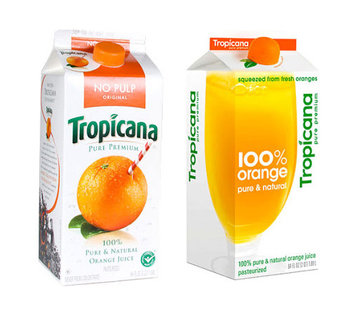
While the Simply brand was growing in popularity, Tropicana provided a stunning example of the business risk in making a major, poorly considered change to a package design. In 2009, Tropicana changed the packaging for Tropicana Pure Premium, its best selling product in North America, with annual sales of more than $700 million.
Tropicana’s ad agency decided to change most of the elements on the package in a major way, walking away from the long-established straw in an orange mnemonic device that had been the centerpiece of the packaging line for years. At the same time, they changed the logo, removing a distinctive type element and replacing it with a modern sans set vertically. Now that the primary visual element on the pack was a glass of orange juice that could be from any private label orange juice, and the brand name has lost its distinction and was also hard to find, the Tropicana consumer was lost.

Despite being introduced with a $35 million ad campaign, dumping the familiar Tropicana brand assets failed spectacularly. Sales dropped 20% in the first two months. Tropicana lost more than $50 million and a large share of sales to competitors, including Simply, before abandoning the new look and going back to their old design.
Consumer research prior to making this big of a design change could have identified key brand assets like the iconic straw in orange mnemonic device, and the familiar Tropicana logo typography, preserving them as key package elements that should be altered very cautiously. In fact it may very likely have done, only to be overruled by the advertising agency’s recommendations.
3. Entrust your package design to package design experts.
Ad agencies with huge resources and offices on every continent are impressive organizations that can offer every service imaginable to their clients, but in the case of package design, it pays to select a specialist.
It takes years of practice to effectively balance the needs of novelty and familiarity required to refresh large packaged good brands “just enough but not too far.”
As shown by the Tropicana example, ad agencies are rewarded by taking risks in their advertising creative that can be dangerous to a brand if extended into package design. If an advertising message fails to hit the target, it can be reworked quickly, at relatively low cost, with little wasted media expenditure. A misjudgment in packaging design can affect millions in hard material costs.
So what next?
 Are you considering a brand refresh or a line extension but not sure of your creative direction? We can help! Schedule a free 15 minute call with one of CMA’s Account Directors. We’ll evaluate your current packaging and offer some insights about extending your design based on your goals.
Schedule a call with us today.


