Simply Line of Juices and Drinks
The Simply brand began as a single product, Simply Orange, introduced to compete with Tropicana in Northeastern markets. Simply has grown into a billion dollar brand, proliferating from a single orange juice flavor into eight orange and orange blend varieties, five lemonades and limeade, and single juice varieties including cranberry, apple, and grapefruit juices. CMA has worked on Simply package design continuously as the brand has grown and evolved since 2001.
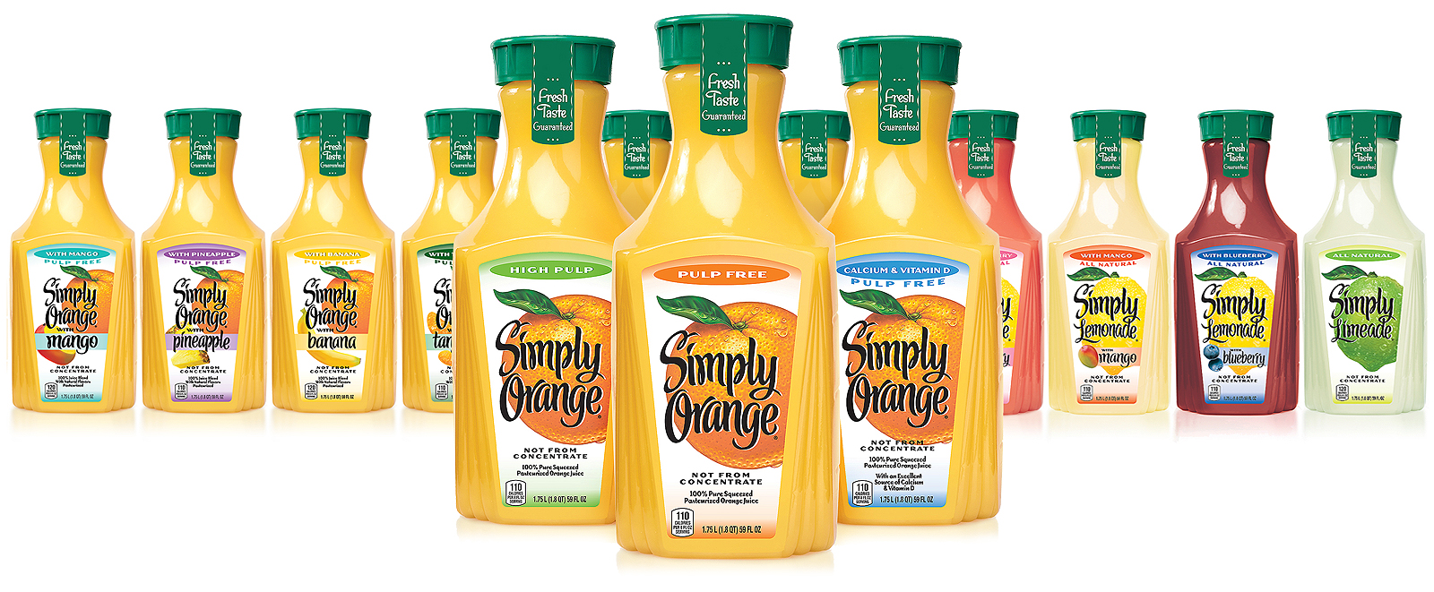
Shown above, the line of Simply products in the original 59 fl oz. carafe form. There are also eight 13.5 fl oz. single-serve packs and five larger 89 fl oz. multi-serve packs. As flavors and varieties were added, the Simply label design became more complex.
Extensive consumer research determined that a redesign of Simply beverages packaging was needed to clarify the Simply positioning, legibility of the brandmark, and to improve product benefit differentiation.
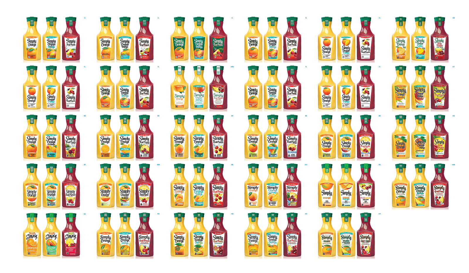
The initial design exploration presented a wide variety of approaches within the bounds of the brand’s identity.
The top three designs were extended across multiple products to further assess branding, flavor differentiation and benefit communication. The ultimate winner: “Honestly Simple.”
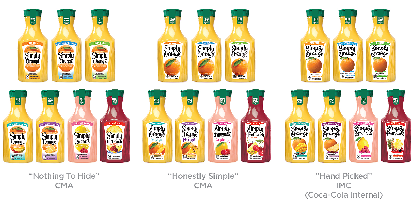
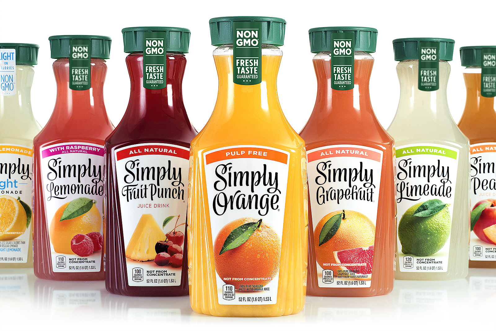
The final design reflects the brand’s core messaging and values through a contemporary and clean look that focuses on being “simple” while delivering a greater amount of taste-appeal.
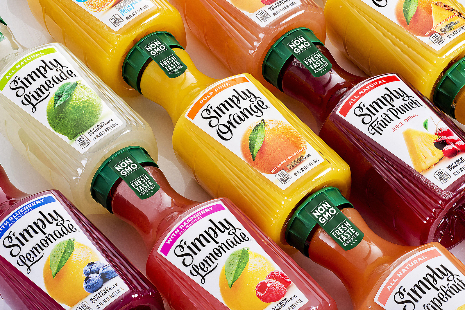
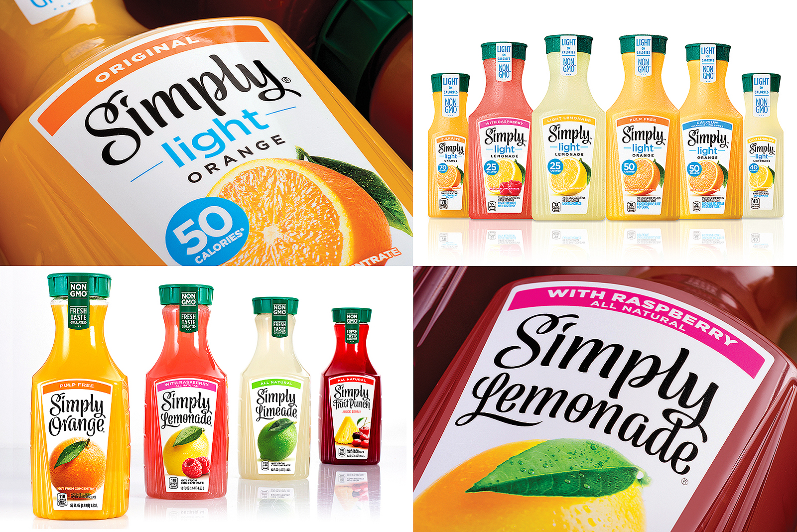
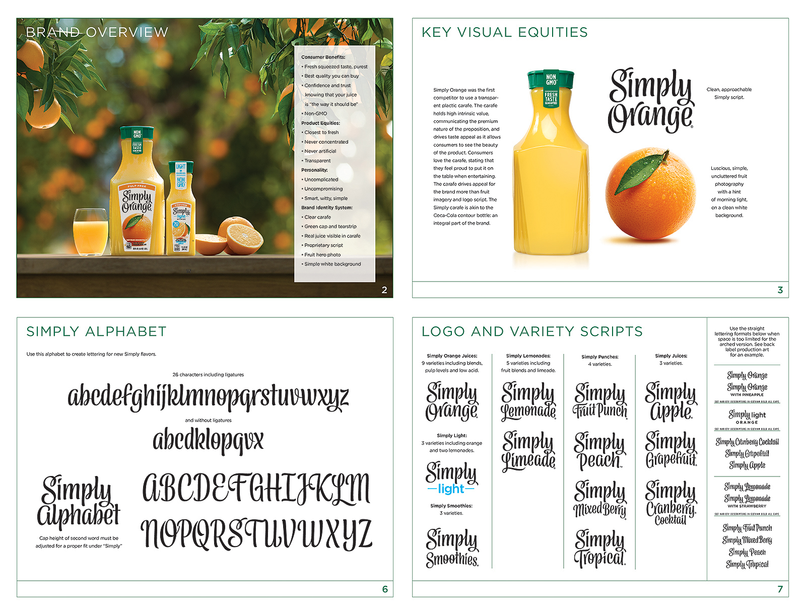
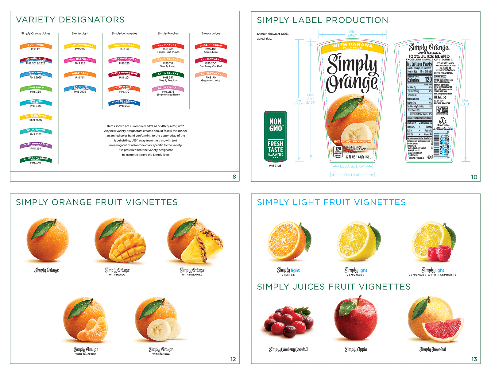
Simply Beverages Graphic Standards Manual
CMA documented the new Simply visual identity system with a comprehensive brand standards manual, including a proprietary script alphabet, photography standards, and sample production files.
