IN 2016, Ebro Foods merged its susidiaries Riviana Foods, American Rice, and New World Pasta Company, to create the second largest producer and distributor of pasta products in the U.S.
As part of its regional brand strategy, Riviana asked CMA to update its venerable Skinner pasta brand, to explore ways of emphasizing a connection to Texas, and strengthen the Skinner brand communication. Focus group research showed that brand loyalists regarded Skinner as a trusted but utilitarian option, but had very little recall of the package design except for the red white and blue color, and some awareness of the rippled edges of the logo.

Research found a set of opportunities to be addressed through redesigning the packaging graphics:
• The brand is seen as every day, all purpose, humble pasta.
• Skinner is seen as traditional, ever-present; but perhaps antiquated.
• Consumers are buying on auto-pilot, yet they see the brand in their peripheral vision.
• A redesign is necessary, but it must live within the brand visual guidelines and personality.
• The colors, and the ripples to a lesser degree, are the strongest package brand equity.
• The colors were ”patriotic”, “all-American”, and even “Texan”.
(A positive to current consumers, but not an advantage to non-consumers).
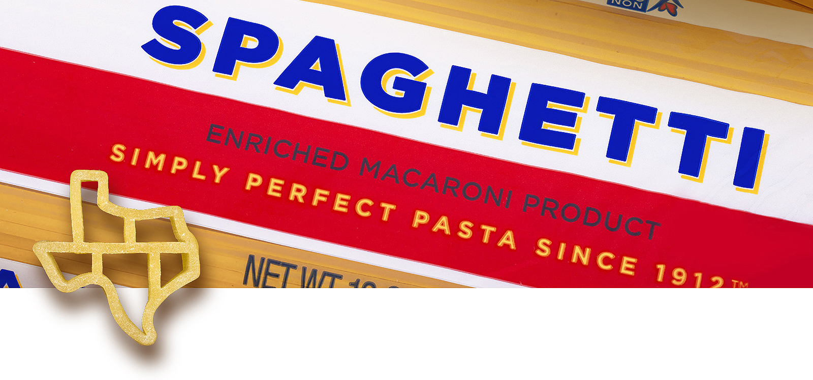
• Most participants showed genuine enthusiasm for the Texas shaped pasta.
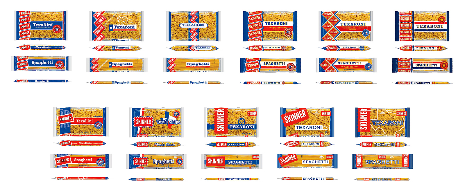
Stage 1 designs explored the balance between emphasizing Texas imagery and retaining
established elements of the Skinner brand identity.
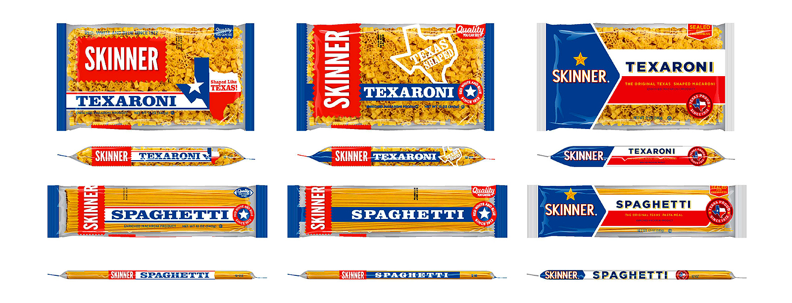
The final design selection came down to choosing between a simplified traditional Skinner logo
with Texas references, or a bolder advance into red white and blue Texas flag graphics.
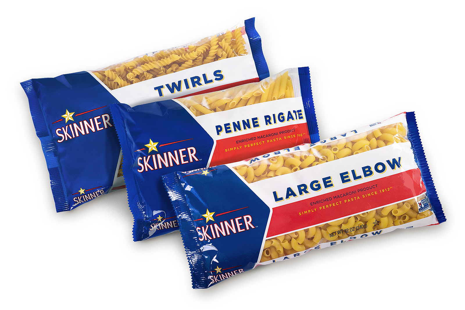
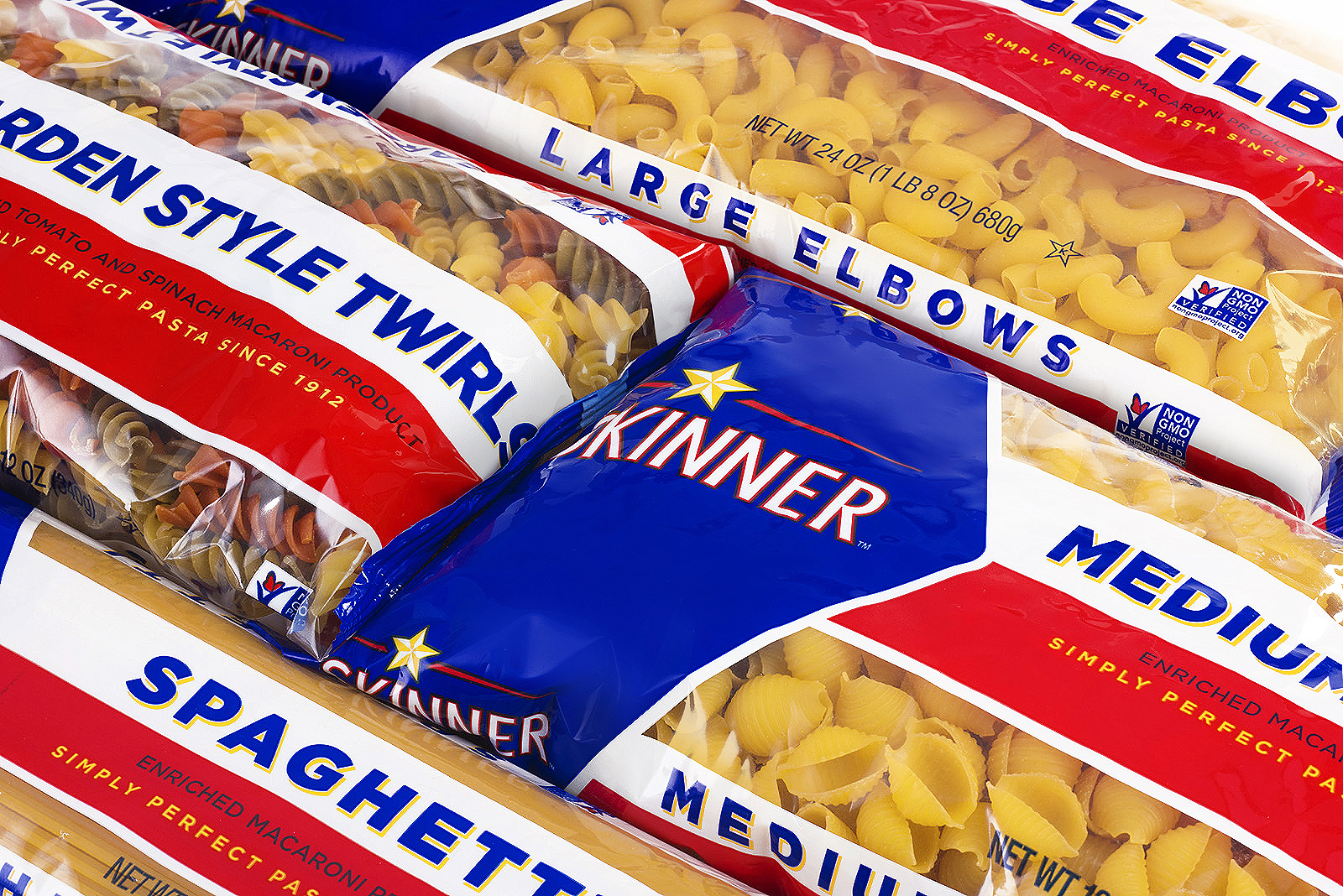
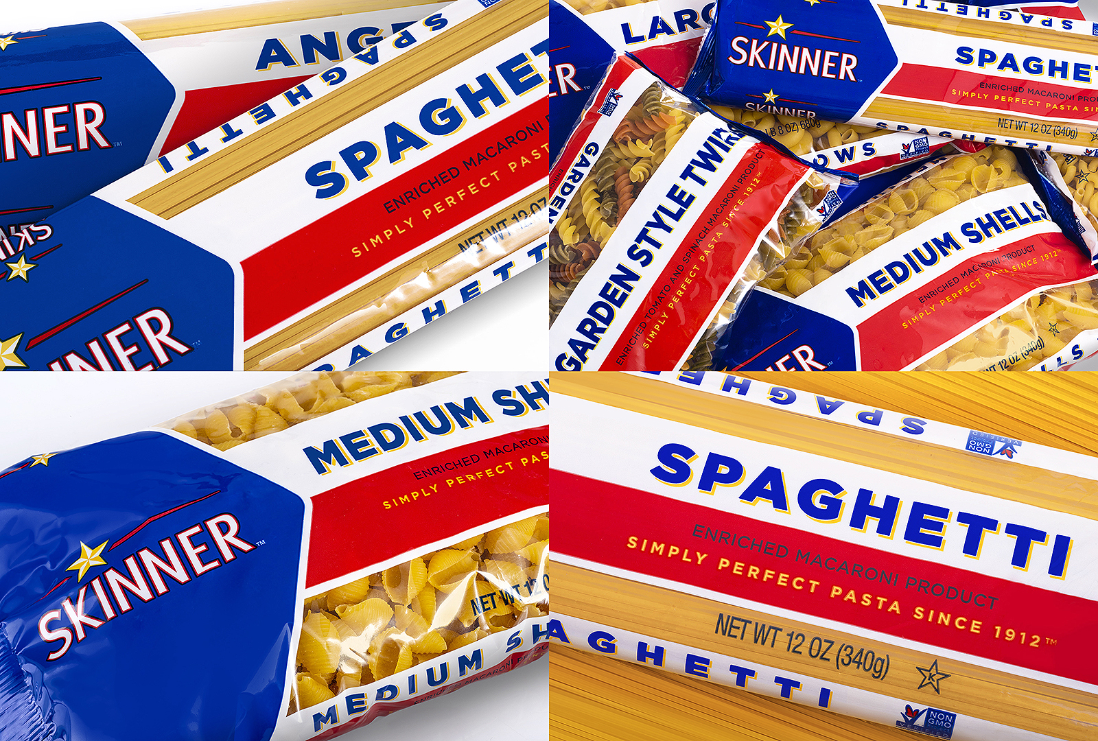
The revised Skinner package design brings a colorful Lone Star entry to retail pasta shelves.
