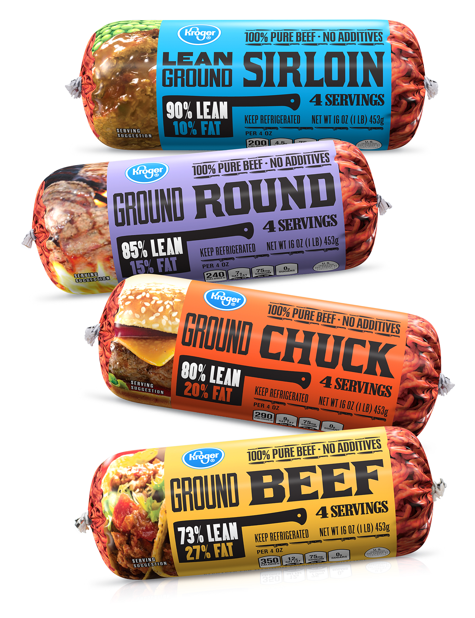
Kroger Beef ‘Chubs’ Packaging
Kroger asked CMA to redesign their ground beef chubs packaging to improve visibility in the case and establish an easy to read, clear system to communicate variety differentiation between beef, chuck, round and sirloin. The design features bright background colors with black typography reminiscent of western wanted posters. The butcher’s cleaver calling out the fat/lean content was inspired by a similar cleaver owned by the creative director’s grandfather, who worked as a butcher at Kroger in the late 1930s.


