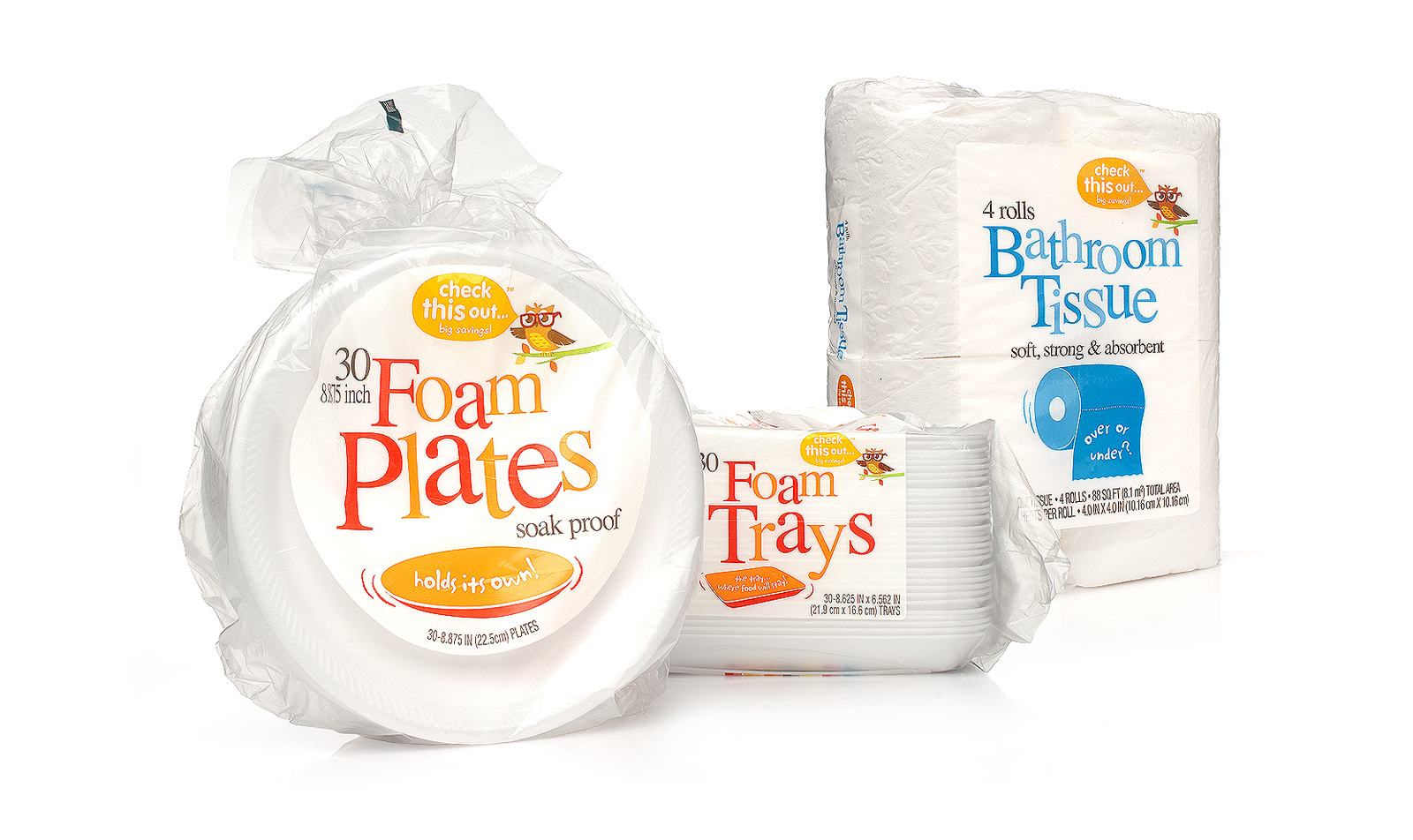
Kroger – Value Line Redesign
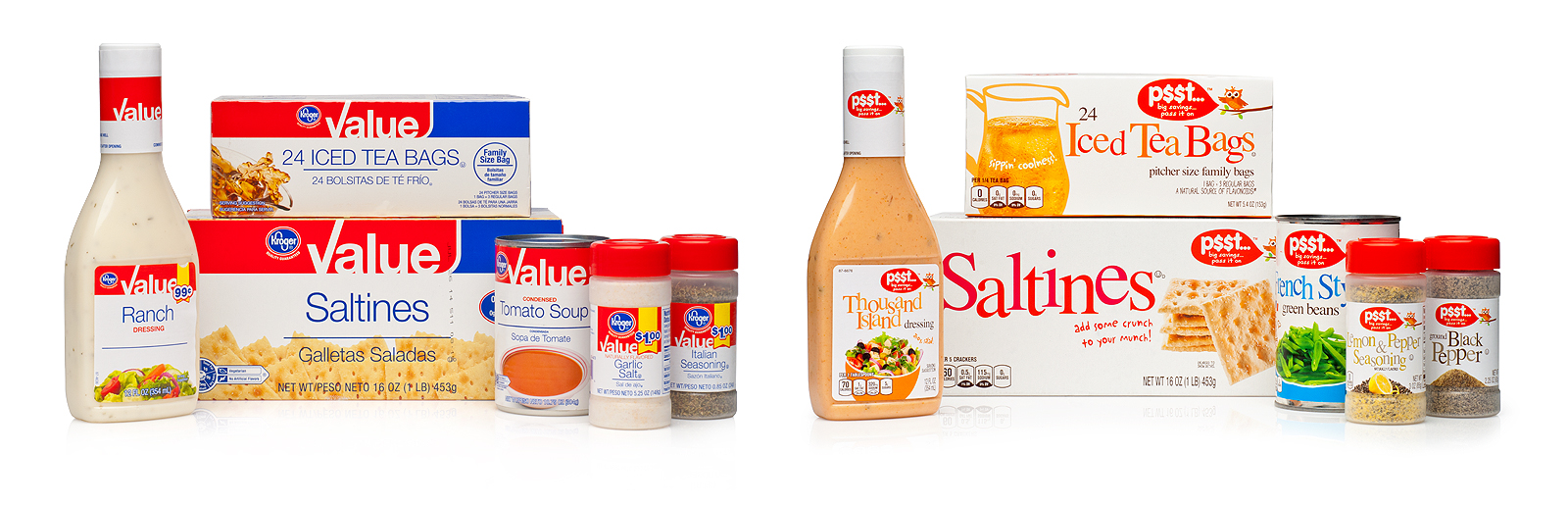
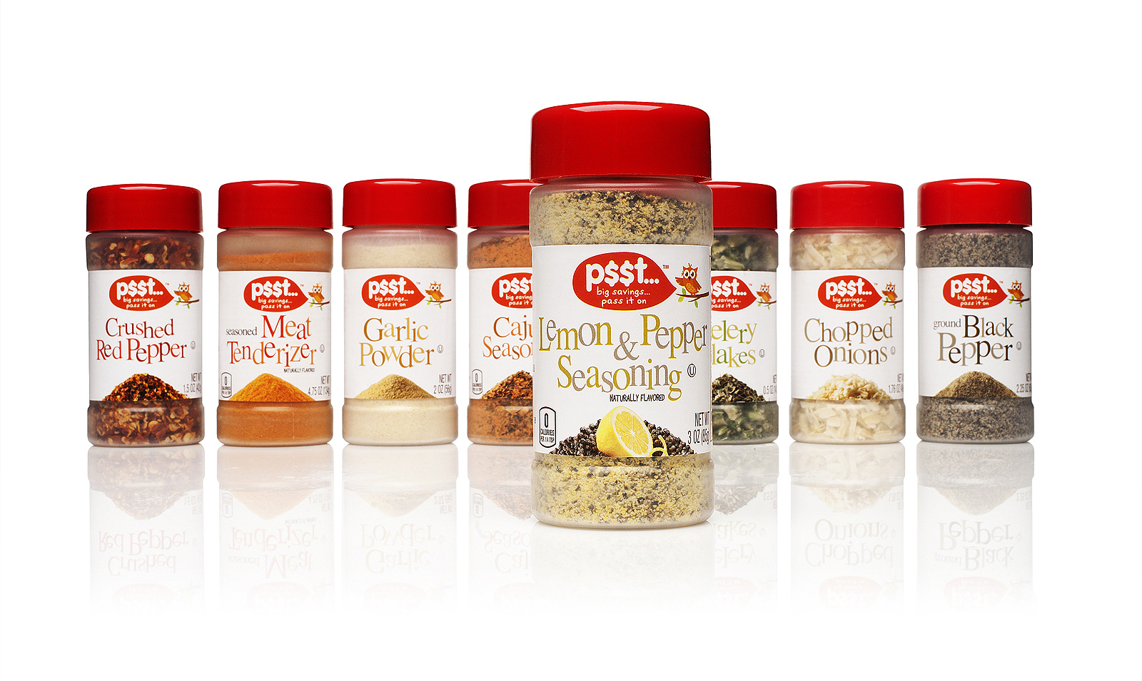
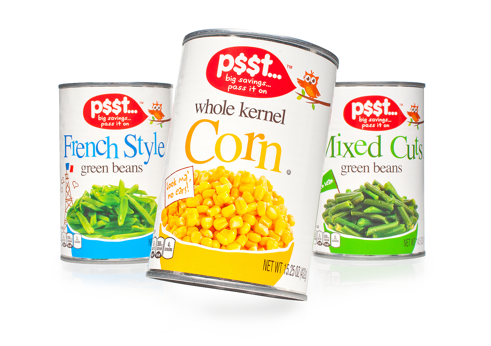
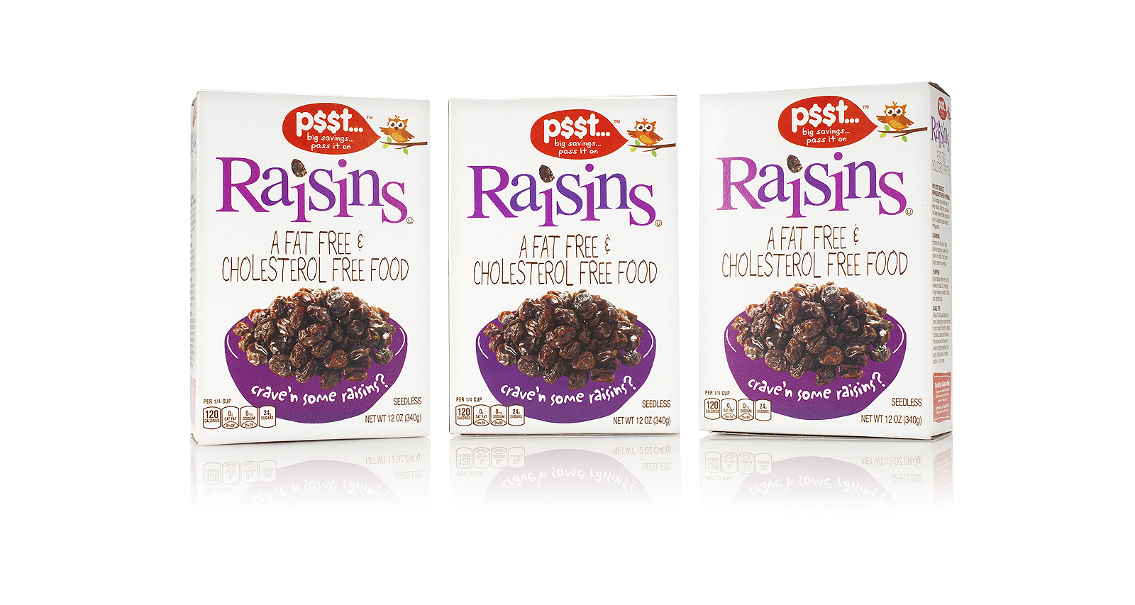
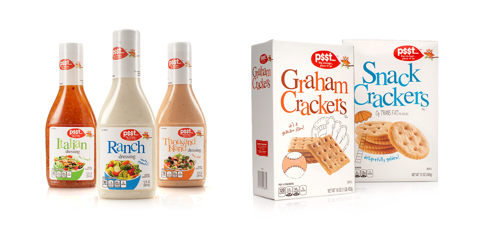
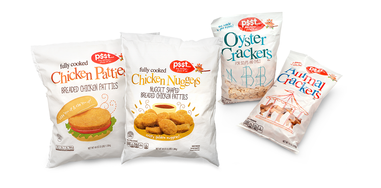
The design challenge here was to make the Kroger value line a more appealing, contemporary and fun option for the economy-minded. CMA won a creative shootout among several firms with a design that built an animated wise owl character into the branding and featured a playfully arranged two-tone type treatment of the product descriptor on a clean white ground. Most of the line featured taste-appealing food photography combined with flat color illustrations, with a touch of added personality through whimsical captions.
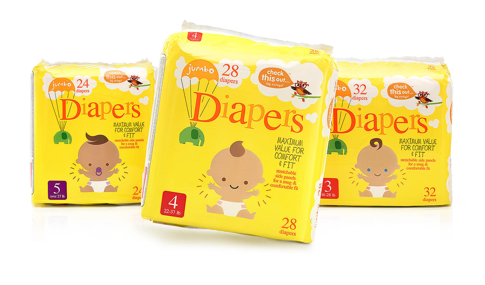
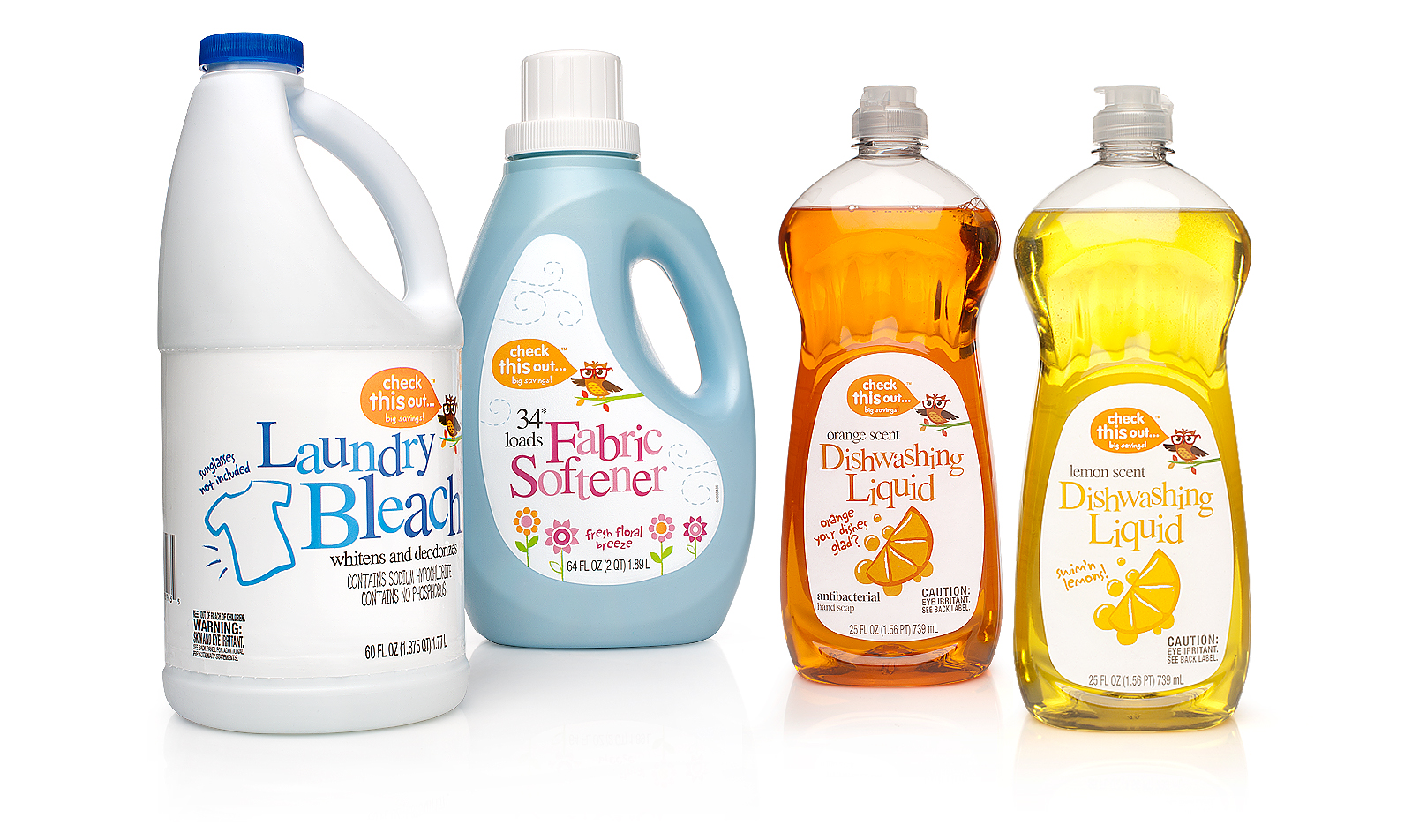
Check This Out brand was created as a variation for Kroger value line paper, laundry and disposable diaper products to distinguish these from Kroger P$$T food items
An example of the design before and after: